Intro to Art 2
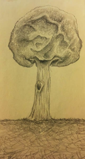
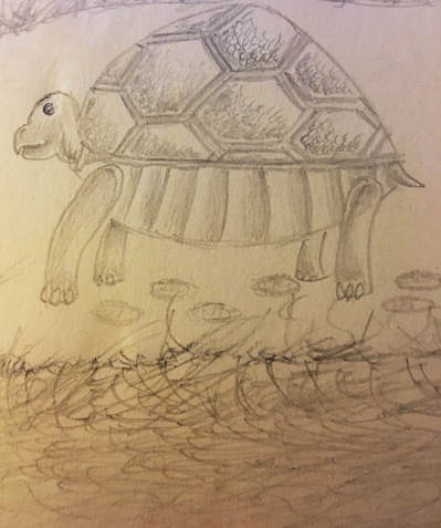
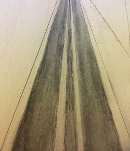
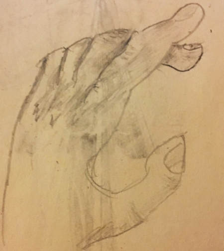
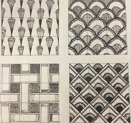
Ladies and Gentlemen we are back! This is my introduction into Visual Arts 2. The first Thing we were instructed to do was to sketch out some concepts and this is 4 sketches I drew on the first day of class.
Motifs and Patterns
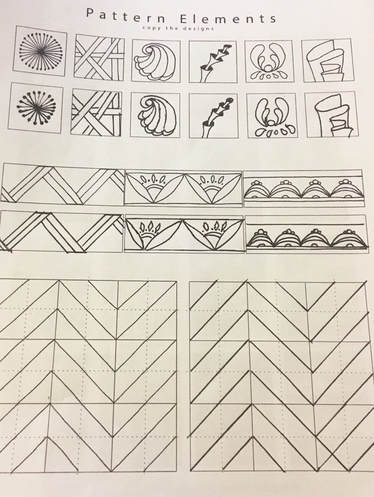
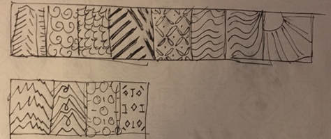
So we are now starting art 2 with motifs and patterns. These sketches here are examples of stippling. The left drawings were printed and I had copied them to the right.
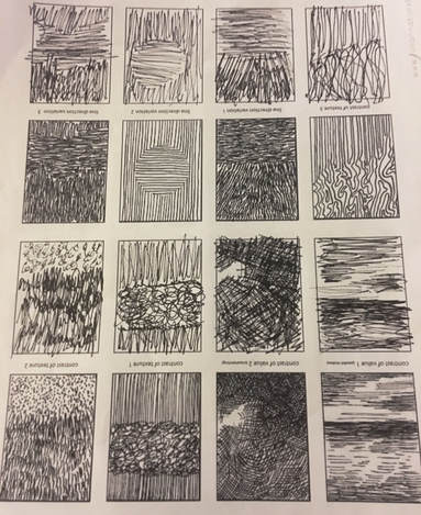
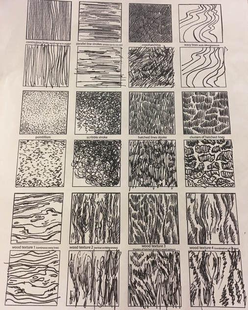
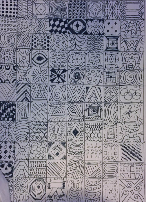
Here are more examples of exercising patterns an motifs through pen and ink drawings. A lot of these have to be carefully drawn to match up and there are multiple styles of drawing these patterns, such as: stippling.
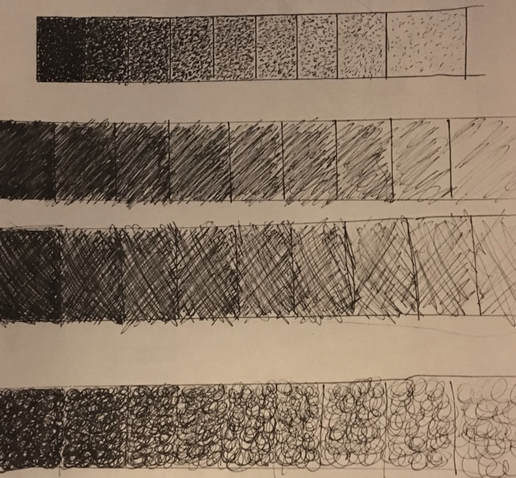
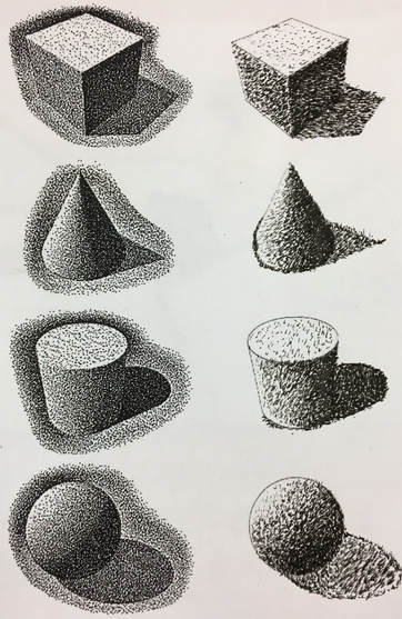
A little our of order here is some of the pen and ink value sketches that we drew to get a feel for how to create value without shading with a normal pencil. Above there is a image of stippling to create values of shapes and this is what we made to get a understanding of how to do this. We also used three other types of drawing value with pen and ink, which includes: hashing and cross-hashing.
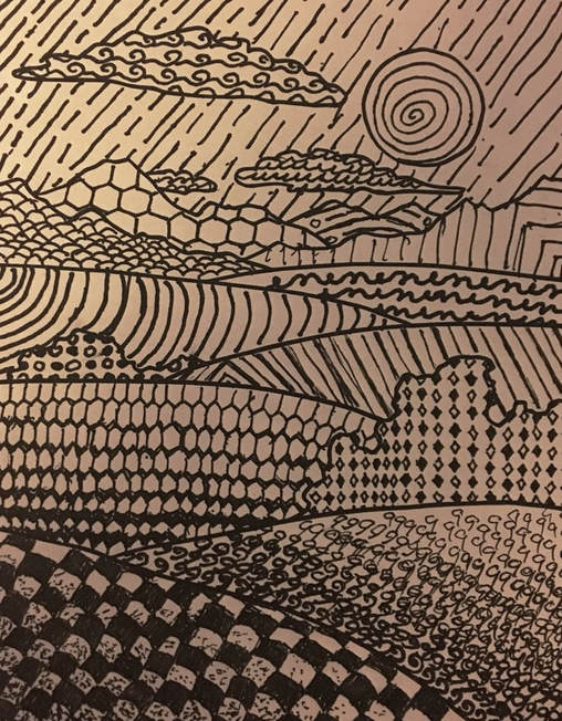
This image above shows a landscape that I have divided each part of the picture and filled in the outlining with my own patterns.I used some of my texture squares to fill in the parts of the picture. For most of this, I would try to create a pattern that would be associated with what I am filling it in with, whether it was a cloud, piece of land, sky and etc.
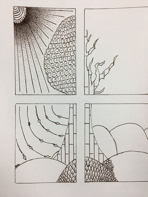
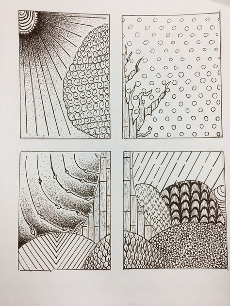
Here are my sketches for my final.
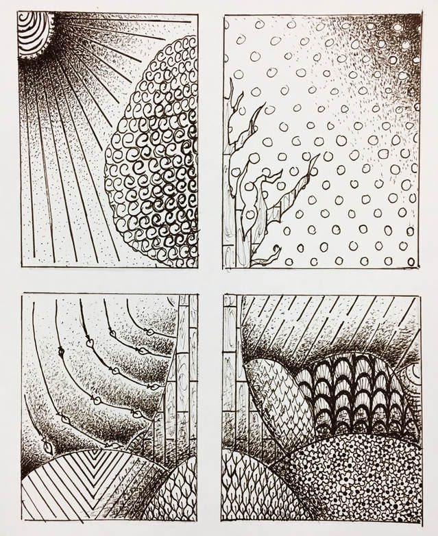
This image above is my final piece for our pen and ink unit in my class. I drew a picture that has a point of view that looks through a window with 4 window panes. Each pane is divided into 1 of the 4 seasons. All the textures and patterns I used in this piece represent each of the seasons. So I tried to make themed patterns to represent and identify which seasons were which. Value was important in this piece because it would show how each hill overlapped each other. The value also distinguished the lights and darks through out the piece, like where the sun was and the tree. I really liked how I crafted my project with how it is set up and the unique creativity used to represent each season. The weather and landscape patterns I used for each season makes each pane distinguishable between all the seasons. With all of this practice of patterns, I was able to construct this piece successfully with what I had in mind. Practicing different types of drawing patterns adds a variety to the picture which will eliminate a static looking piece. If I do any more pen and ink then this unit will have helped me with any future projects. If I could redo this project, i would make some of the patterns more neat and try to add more value changes.
Watercolor
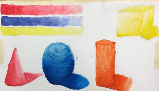
Above were watercolor painting techniques we used as a tutorial to the unit. These were all the basic ways of using watercolor paint which will eventually help me throughout this unit.
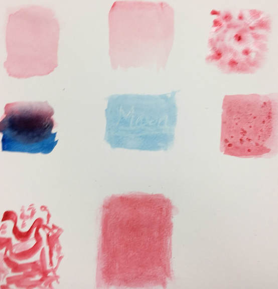
Here is a picture of my practicing with watercolor. I made three value charts with three different colors. I alos practiced with multiple shapes using shading of watercolor.
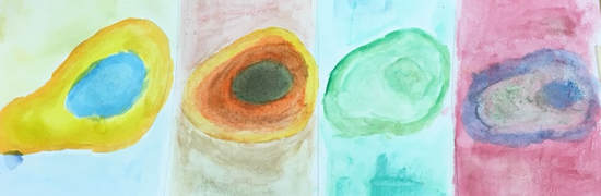
Here is a picture of four avocados with a different variety of watercolor tones for each one.
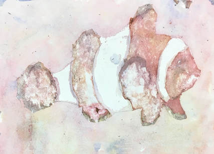
so this is my final for the watercolor unit and this was a unique final because we had a guest come to our class and show us a interesting way to use watercolor. My final is supposed to be a clown fish. So this technique of watercolor was to pour our paints on a piece of paper then use masking fluid to keep whites, lighter colors, and details we liked when we poured the water and paint. This was a repetitive process where we would use masking fluid on the paper, let it dry, pour water and paint on the paper, then let that dry and repeat all over again until you're satisfied with all the colors that are covered by the masking fluid. What is difficult about this process is the timing of waiting for the drying of paint and masking fluid. If these things aren't timed right you can rip up your piece like I did. Four things I learned about this technique was how to use a hair dryer for drying the paint, the distribution of colors to get value and colors right, how masking fluid works, and how to draw a fish. if I could do this project again, I would redo the masking fluid before I had even started the paint, and I would be careful while drying my work so that it wouldn't have ripped. With multiple coats of paint, I was able to make things darker to create layering of the protruding parts of the fish and the masking fluid to show the whites and lighter colors of the fish. Between the practicing and the guest helping with my project, I was able to make a successful piece that I personally feel like could be improved but not because of how I painted. The guest really helped especially since he came up to me and showed me first hand how to use this technique properly. The guest didn't really persuade me into becoming a professional artist, but with him coming in and showing us what he does, I can absolutely respect his work and I am intrigued by the way he does work with watercolor.
Prisma Color Pencils
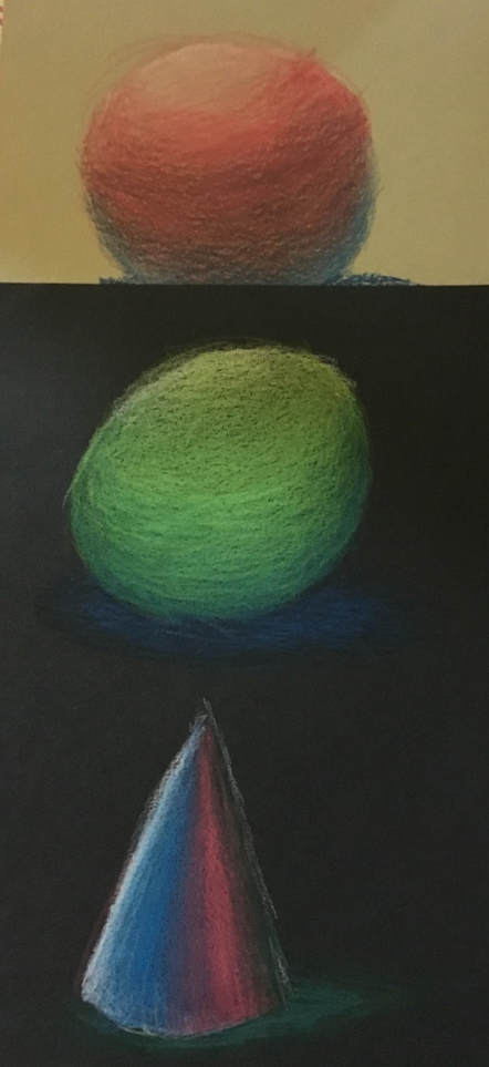
Here are shapes we drew to gain some practice with prisma color pencils.
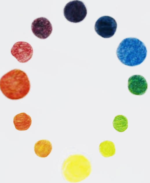
Here is a little color wheel made to show the difference and blending of colors to make different colors.
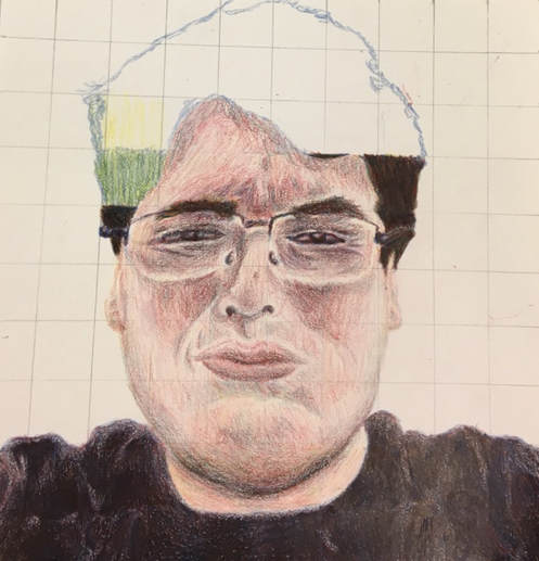
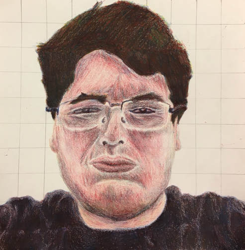
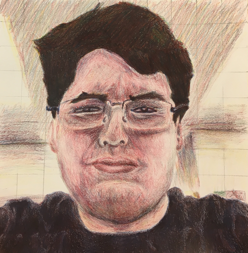
This is a self portrait of my beautiful face only drawn with the primary colors. Overall, I think its neat but there are some things that could be straightened up like the background. When it came to mixing colors, it wasn't too hard because I would take another sheet of paper and practice making colors. I did follow directions and draw box by box as you can see on the picture. There are areas where the color is inconsistent because I went box by box. This will help the overall portrait because it really does help with the accuracy and shapes on my face, clothing, and hair. I created value changes with using the blue pencil because that will create the darker shadows all around the portrait mixed with red. Yellow will help bring out the lighter colors on the portrait. I was prepared for this project because I've done a self portrait without color so with the practice earlier, I felt prepared. My man, Myles had a great change of values on his self portrait. Half of his face goes from a very dark color to a much lighter color which accurately show the shadows from his picture.
Acrylic Paint
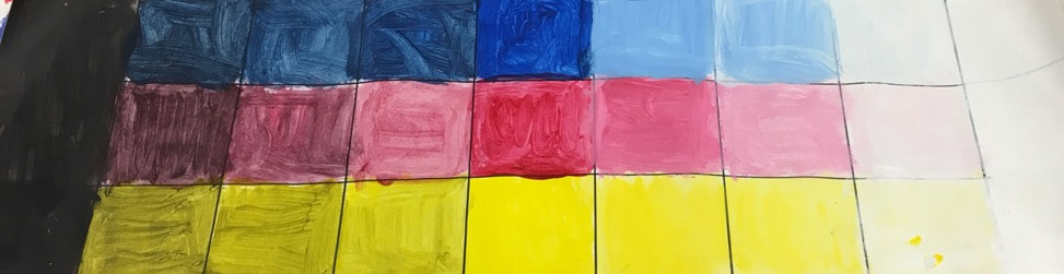
Here are some value charts with the main three colors to start practice with acrylic paint.
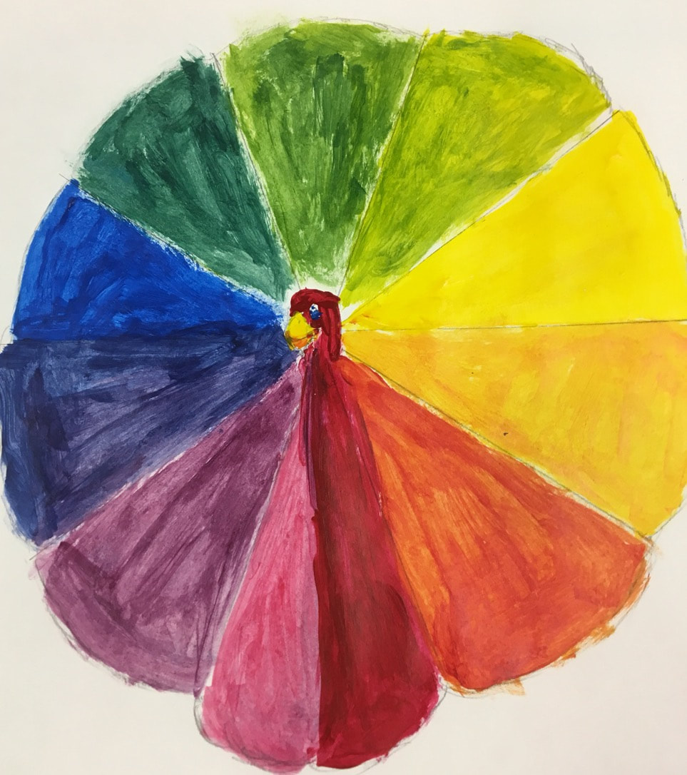
Here is a unique color wheel we were tasked to make using acrylic paint. I chose to make a turkey type of theme with its feathers and body being apart of the colors.
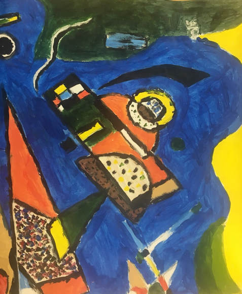
Here is a part of an obscure art piece. I don't know the name of it but its shapes give it a almost musical theme.
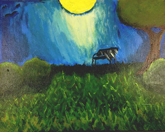
This piece was modeled after artist, Henri Rousseau. The four main ideas I used in this piece to represent Rousseau are: Naive, Amateur, Nature, and Wildlife. It was very difficult to paint like Rousseau even though his work is said to be amateur. He is very unique and for me to try and copy his painting style was very difficult. I had to see what kind of colors he used, what kind of landscapes he used, and how he shaped and formed the objects in his painting. I had to try and mimic the way he painted his nature scenes with my own. The most difficult part of this piece was to try and find a landscape that could be comparative to something he would paint especially since he would mostly paint jungle scenes. i had to pick a mix of bright and dull greens throughout the painting to match Rousseau's style since he had bright green paintings or gloomy types of paintings. I chose this type of landscape to match his work because it is a more modern and close by setting that kind of matches his nature scenes he had. If I could do this project again I would try and add more animals than those really simple birds in the top left corner, because he would incorporate many animals in his work especially since he painted jungles.
Clay
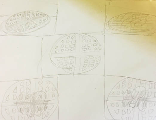
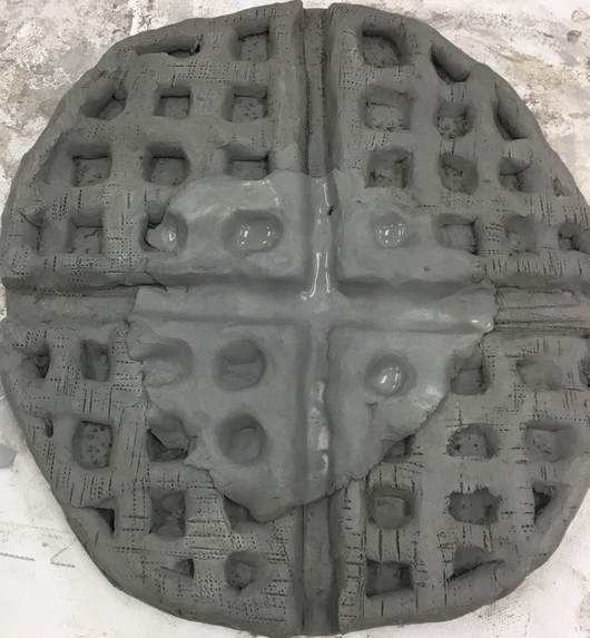
Here is my sketch and in-progress photo of my clay food sculpture.
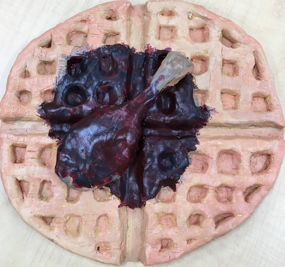
This is my final 3D Clay Food final project. I decided to make chicken and waffles. Admittedly, even though I am the best artist in the world. I am the worst clay artist in the world. I had very sloppy craftsmanship with the clay itself because I did struggle with how to form clay and texture it properly and its texture. The most difficult part of this project was the paint because I had to fill every crevice with all the holes and cracks in the clay with the waffle and the syrup with the chicken on top. I also struggled with getting the right color with everything on the clay. Harmoniously would be the absolute opposite of how my colors "blended" together. It all really just looked weird with the colors I chose. You have to be careful while sculpting because it is very much more hands on than 2D art while drawing. You are molding instead of drawing an illusion on paper. I would press on the clay with my thumbs, use tools to make jagged edges and textures on top, and I would smooth out some areas too. I was not necessarily able to make this look like food, according to my peers, this piece looks like the opposite of food. I would change the color choices and be more precise in the form of the clay if I could do this project again.
Research Paper
https://docs.google.com/document/d/1lsJ9ZaBnlSc7yorenEUi3BalQm96a27IjbvDjBb5EW0/edit
Art 2 Final: Senior Edition
It is reflection time for Art 2. Art 2 was based a lot around painting and learning how to manipulate colors to make new colors and make unique art. At the beginning we started with drawing which was a personal specialty of mine and as time went on, the class started focusing on painting which is not a specialty of mine. So technically I got worse as time in the class went on but I did get better at the things that we learned while in this class. I was able to learn how to draw with color which I have always despised because I'm way better at drawing or making art in plain black and white. At the beginning I could not paint for my life but I have gained some skill when it comes to different techniques or different colors and how to mix them. I am equally just terrible at clay. I hate clay. I was able to improve my pen and ink skills at the beginning with patterns and motifs. I did enjoy Art 2 because it definitely challenged almost everything in art that I struggle in, so it was interesting to look at the improvements other than clay. I was out of my art comfort zone with all the painting, sculpting and types of drawing we had to do, but it all overall helped my artistic skill. I will always be the best artist and no one can dispute that because there is no such thing as good or bad art. Its all based on preference. Therefore I believe I should get a 100% in this class because even though there is no such things as perfect. I am.
